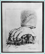
Figure 5.5. A cartoon about child labor by Lewis Wickes Hine, circa 1912 Source: https://www.loc.gov/pictures/item/2018675184/
Short alt text: A political cartoon.
Long alt text: A large hand crushes a group of young children, hunched over from the pressure. The hand wears a diamond ring and has a shirt sleeve with “Child Labor Employer” printed on it.
Editor’s Tip
Notice how we do not repeat the topic of the cartoon, as it was provided in the caption. If this were an art book, the style of the image may be described; but in this case, it is simply the content itself that is needed.
Line Graph
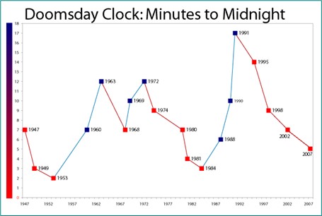
Figure 7.2. The Doomsday Clock depicting movement to and from nuclear war. Red indicates a change closer to nuclear war, and blue indicates a change toward world peace. Source: https://commons.wikimedia.org/w/index.php?title=Special:Search&limit=20&offset=60&profile=default&search=line+graph&advancedSearch-current={}&ns0=1&ns6=1&ns12=1&ns14=1&ns100=1&ns106=1#/media/File:Doomsday_Clock_Graph_2007.png
Short alt text: A line graph titled “Doomsday Clock: Minutes to Midnight.”
Long alt text: Data represents 1947 to 2007. The point closest to nuclear war was 1953 at just under 2. The point closest to world peace was 1991 at just over 17. There was movement closer to nuclear war from 1947 to 1953. Between 1953 and 1963, there was movement toward world peace. Between 1963 and 1968, there was movement toward nuclear war. Between 1968 and 1972, there was movement toward world peace. Between 1972 and 1984, there was movement toward nuclear war. Between 1984 and 1991, there was movement toward world peace. Between 1991 and 2007, there was movement toward nuclear war.
Editor’s Tip
Notice how we do not provide a value for every point depicted, but instead give the highest and lowest points before describing trends. If the text was asking students to evaluate a specific time period or answer questions about certain years, then more details should be given for some or all of the data points.
Venn Diagram
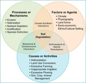
Figure 1.3. Soil degradation is caused by a variety of factors and processes. Source: https://commons.wikimedia.org/wiki/File:Soil_degradation_venn_diagram.png
Short alt text: A Venn diagram depicting three larger categories of soil degradation: processes or mechanisms, factors or agents, and causes or activities.
Long alt text: Processes or mechanisms and factors or agents overlap as climate-soil-biotic interactions. Factors or agents and causes or activities overlap as anthropogenic and natural perturbations. Causes or activities and processes or mechanisms overlap as biophysical and socioeconomic interactions. The processes or mechanisms are erosion, salinization, nutrient depletion, acidification, and species extinction. The factors or agents are climate, physiography, land forms, and socio-economic and ethnic/cultural setting. The causes or activities are deforestation, land use conversion, extractive farming, inappropriate irrigation, excessive plowing, and soil, crop, and animal management.
Editor’s Tip
Notice how we provide all elements of the Venn diagram because the caption is suggesting all content is important. Listing the individual elements (erosion, etc.) may come before or after listing the overlapping categories (climate-soil-biotic interactions, etc.), depending on which seems more important for student understanding.